This article is for you if:
- If you want to use metallic gold or silver in your logo
- You want to understand how metallic colours look in various formats
- You want to understand the challenges you may face
- You want to check the cost implication printing gold can have
If you want to use Gold or Silver in your logo, you clearly have great taste. Many luxury, deep, mysterious and high-end brands use gold and silver in their branding. However, to prevent you from having a journey of surprise – we wanted to help educate you about everything you need to consider when selecting a metallic colour.
What is Gold and Silver?
Gold and silver are both metallic elements that are used for jewellery and as a store of value. Gold is a dense, soft, shiny, and malleable metal that is yellow in colour. Silver is a dense, soft, shiny, and malleable metal that is white in colour.
Gold and silver have long been associated with wealth, beauty, luxury, and prestige. The colour gold has been prized for its beauty and radiance, and has been used in art, jewellery, and other decorative items throughout history. In many ancient cultures, gold was considered to be a symbol of wealth and power, and was associated with the gods.
Similarly, silver has been cherished for its beauty and has been used to make various art, jewellery and other decorative items, It is also associated with the moon and the night sky, and is thought to have a calming and soothing effect.
What makes Gold and Silver different to standard colours on a screen and in printing?
Gold and silver are metallic colours, which means they have a reflective quality that makes them appear shiny and bright. This creates a more complex and nuanced colour than other colours on the screen or in printing. Gold and silver in print are created using special pigments that help achieve the metallic effect. This is different from other colours, which are typically created using a simple combination of CMYK or RGB colours. Additionally, the way in which gold and silver are rendered on screen and in print can vary depending on the medium. For example, on a computer screen, gold and silver colours are typically created using a combination of red, green, and blue pixels, whereas in print, they are created using a combination of ink colours. This can affect the way in which the colours appear to the viewer.
Bottom line: Gold and silver on the screen will usually have to be a flat colour (which doesn’t look metallic) and more like this:

As opposed to this:

In the beneath examples, we refer to gold. The same applies to any other metallic colour, including Silver and Copper.
I have seen reflective Gold on screen before, can’t you make it work?
Below is an example of a stunning reflective gold mockup of a logo. The reason we cannot use this on a website is because we have had to place it at an angle to demonstrate the light reflection and how the gold signage could appear once built up by the sign maker. If this was a front-on flat view, you would not be able to achieve this effect as beautifully:
Gold as a mockup (unusable on a website)

3D Mockup Only
Instead, we can use a combination of brown and white to achieve a satisfactory effect:
Gradient Gold

Or you could do as Harrods has done and go for a flat colour that best represents gold:
Flat Gold

Bottom line: Gold on the screen will never look like a real piece of gold jewellery.
Type of golds
| Flat Gold | Gradient Gold | Foil Gold |
| Usage: Screen | Usage: Screen | Usage: Print |
 |  |  |
| Pro of Flat Gold: Works on screen (digital) and printing. | Pro of Gradient Gold: Works on screen (digital) and printing. | Pro of Foil Gold: Look’s stunning in print and is reflective |
| Con of Flat Gold: Doesn’t look metallic | Con of Flat Gold: Doesn’t look shiny | Con: Can only be used in printing (not on screen) and very expensive to use in print compared to a standard colour |
Costs for printing metallic Gold
You may have seen metallic gold on print, sometimes on invitations or expensive packaging. This is achieved by using a foil-blocking process in print. The gold foil printing process in a commercial press involves using a specialised printing plate that is made with a raised image or design. This plate is then coated with a heat-sensitive adhesive, which is then heated and pressed onto a sheet of gold leaf. The plate and gold leaf are then run through a printing press, where the plate applies the gold leaf to the desired areas of the printed material.
In some cases, the gold leaf is also coated with a thin layer of varnish or sealant to protect it from wear and tear, and to make it more durable.
The gold foil printing process in commercial press is typically used for printing on business cards, invitations, packaging, book covers, and other items that require a high-quality, luxurious finish. It is a specialised technique that requires a skilled operator and specialised equipment, and therefore it can be more expensive than traditional printing methods.
Printing price comparison example:
| Standard Printing (Full Colour) | Gold Foil Printing | |
| 500 Business Cards | £27.00 | £145.00 |
| 500 A7 Appointment Cards | £45.00 | £173.00 |
| 500 Letterheads | £55.00 | £315.00 |
| 500 A5 Invitations | £74.00 | £215.00 |
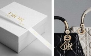
How Dior uses Gold:
Dior uses Black as it’s base colour on its website and simple print materials.

Dior then moves to metallic colours in certain packaging and luxury item production.

This approach by Dior combines a sophisticated timeless colour (Black) with luxurious touches (Gold and Silver)
What do our clients usually do?
Our clients will usually stick to a flat gold or gradient gold as below for both website usage and printing. The additional spending on printing is usually not justified for most in a practice setting.
Flat Gold

Gradient Gold

Fill in the enquiry form below, to find out more about our branding packages:


